Photo by Markus Spiske on Unsplash

Jay Phelps, Reactive Programming nut and compiler enthusiast.
Testing, for me, is a love-hate relationship. On one hand, I absolutely love the feeling that comes from having great test coverage: I can ship new features fast, fix bugs and be confident they won’t return, and above all, effectively collaborate with teams both large and small. On the other hand, writing and maintaining visual UI tests takes time. And I’ll be honest: Even if I love the results, I don’t enjoy writing them.
But over the years of writing tests in countless languages, frameworks, and platforms, I’ve found that not all tests are in fact worth the effort when you’re testing applications rather than libraries. As Kent C. Dodds says in his wonderful post:
“Write tests. Not too many. Mostly integration.”
In the rest of his post–with which I 100% agree–he describes the potential value vs. cost of different forms of tests. The so-called “Testing Trophy.”
"The Testing Trophy" ?
A general guide for the **return on investment** ? of the different forms of testing with regards to testing JavaScript applications.
– End to end w/ @Cypress_io ⚫️
– Integration & Unit w/ @fbjest ?
– Static w/ @flowtype ? and @geteslint ⬣ pic.twitter.com/kPBC6yVxSA— Kent C. Dodds ? (@kentcdodds) February 6, 2018
I absolutely love this.
However, as I continued to strive to write regression tests efficiently, one case eluded me: design. In the case of the web, design means the resulting HTML and CSS, of course. That is, what your page looks like.
Snapshot Testing? Nope.
For a few years, I thought the go-to solution was Snapshot Testing. But HTML snapshots, in particular, can be notoriously overvalued, and they still don’t include CSS, a key factor. To be clear, though, snapshot testing is still useful in certain other cases. Even if you did somehow include CSS in your snapshot tests, like with inline styles, it still wouldn’t matter what something actually looks like. Do you care that you’re using two divs or one? How about whether you’re using Flexbox or tables? Definitely not!
What we care about is what the user actually sees. The pixels on the screen. So what we need to do is take a snapshot of those pixels and somehow compare it to a baseline. This has many names but is often referred to as Visual Regression Testing.
There’s just one problem: If you’re familiar with how pixels work, it’s probably easy to see (pun intended) that comparing pixels exactly 1:1 is an extremely brittle process.
Two screenshots that look identical to humans could have entirely different pixels. In less extreme, but more common, cases, even slight differences would cause a visual test failure.
For example, changes in anti-aliasing are common, even if human eyes don’t notice them.


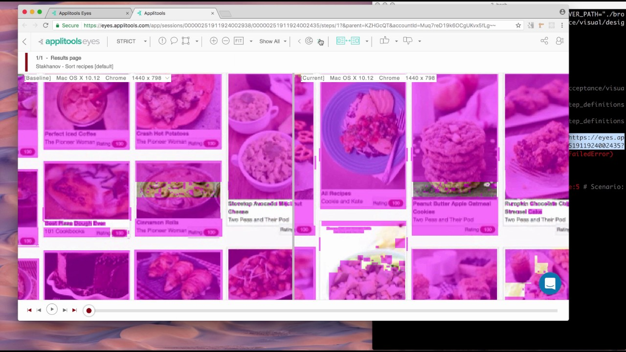
Even though we didn’t change any CSS and the menus appear visually the same, if we just compare their pixels 1:1, we find that a lot of it has changed! This can happen between browser versions, underlying hardware changes on your cloud platform, or just simply because you moved something one pixel to the right.
Similar situations happen all the time, such as in how images, drop shadows, etc. are rendered. Every graphics card renders text and images differently at the pixel level. Your machine will likely have a different graphics card than the UI testing server and the other developers. While the naked eye can’t tell the difference, it’s clear that we need to a way to make computers “see” the screenshots like we do.
ML and AI, Not Just Buzzwords After All
Fast forward to earlier this year. We started doing some developer relations for the folks at Applitools. The idea of Applitools Eyes for Visual Testing is that by combining Machine Learning, AI, and some good old fashioned heuristics, we can finally write automated Visual Regression Tests that compare the screenshots as a human would. To be totally honest, I was super skeptical given my past experience with pixel comparison testing. But the more I tried it, the more I found it exceeding my expectations.

If you’re already writing end-to-end (E2E) or integration tests using test automation tools like Selenium, Cypress, or WebdriverIO, you can slide Applitools into them with very little ceremony. Or, you can also utilize the integration with things like Storybook for React, Vue, or Angular, giving you both a valuable way of maintaining and visualizing your components and confidence that you won’t accidentally break them.
Summary
Traditionally snapshot testing your HTML text is almost never the right solution to test that your UI looks the way it should. We should use automated visual regression testing instead.
Doing 1:1 pixel comparison of screenshots can have frustrating false positives, leading it to be too brittle for long-term, practical usage.
You can leverage the modern advances in machine learning by utilizing something like Applitools.
Find Out More About Applitools
Find out more about Applitools. Setup a live demo with us, or if you’re the do-it-yourself type, sign up for a free Applitools account and follow one of our tutorials.
Or, to read more, check out some of these articles and posts:
- How to Do Visual Regression Testing with Selenium by Dave Haeffner
- Visual Testing FAQ
- The ROI of Visual Testing by Justin Rohrman
- Webinar: DevOps & Quality in The Era Of CI-CD: An Inside Look At How Microsoft Does It with Abel Wong of Microsoft Azure DevOps
- How to Run 372 Cross Browser Tests In Under 3 Minutes by Jonah Stiennon
- Applitools Blogs about Visual Regression Testing


