It’s commonplace to see a form on a website; some are truly awful, some, believe it or not, can actually be a pleasant experience. But most have some method of validation on them and in my experience, checking this validation is something teams look to automate. It makes sense: populate a few fields, or leave them empty, click submit, and ensure the correct validation is delivered by the site. These are positive and negative scenarios.
Recently though, I was thinking about the form validation automation I have done in the past, and questioning its effectiveness. In my opinion, validation errors and message are there to talk to the user, to help and guide them into being able to complete your form. This is most commonly done using the colour red. Field, labels, error text, popups and messages tend to be all subject to being coloured red. It was this use of red that had me question my normal approach to creating automated checks for form validation.
Now, I’m no UX (User Experience) expert, but happen to know some very good designers. I asked them, why do we use red? It fairly obvious really, it’s a colour we all associate with stopping and damage. This is backed up in the Microsoft design guidelines:
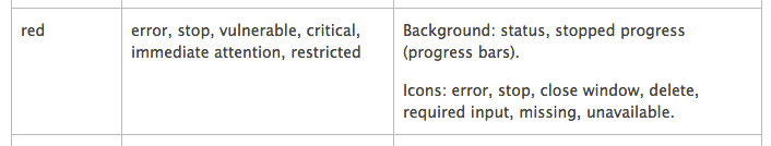
So clearly the colour is very important, along with the language and the placement of these messages. Which is where I started to question the effectiveness of my automated checks. Do I actually check the colour of the message? Do I actually check the placement of the text? Well, let’s answer that my exploring a normal approach to creating such automated checks.
I am going to use the “Join GitHub” page for this example. If you load that page and leave all the fields blank and click “Create an account” you should see something like this:
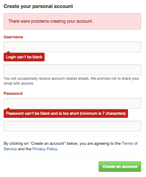
This is a pattern I see across a lot of sites. The error message at the top of the page, the field/label changing to red, and a contextual message for each field that has a validation error, with that message being location near said field. So I see 3 things I would want to interact with here: the error panel at the top of the page, labels of the fields and the contextual message for the fields.
So let’s start with the error panel. In this instance, it’s a div, but it has a class which indicates its purpose and style, that is “flash-error”. I tend to treat this as enough. When creating the automated check, I can see that this class controls the style and that it is indeed red. So by finding this element using its class, I infer that it is styled correctly. Then, obviously, I assert the text that is inside the div. So I am not really checking that the box is indeed red, and not checking its location at all. You ever done this?
Then we have the labels. When the page first loads, the label is directly under a dl>dt elements that has the class of “form”. When the validation fails, a new div element is introduced between the dt element and the label: that div has the class of “field-with-errors”. So now I have something to check. I can see that this class, as with the flash error above, is causing the label to go red. So now I can use that as a locator for the label. So it would probably go with something like:
By.CssSelector(“div.field-with-errors input[name='user[login]']”)Ensuring to get the label I require, so in this instance the Username label. So if this locator return an element, I know that the label is red. Or do I?
Then the final thing we can check is the contextual message. This is actually controlled using the css ::before and ::after tags, which are in a dd element with a class of “error”. So not an easy element to locate. I would probably seek help from the development team to make it easier, if they’re not available, you could still locate the element, but you would probably have to find all the dd’s elements with that class and loop through looking for the one you want, which is far from ideal. But again, the same pattern applies when I’m using the class to confirm the style of this contextual message.
So,in summary, now that I take the time to criticise this approach, this isn’t great. Which is why in subsequent frameworks I built, I would start asserting on the important css values, such at the background colour and the text colour, so now I am able to assert the colour of the text and the messages. Better.
There is still the location problem.I am not checking the location of these elements. Of course I could assert on the X & Y co-ordinates, but I avoided that wherever I can; it can get very messy, very fast.
So one could argue that this is good enough. However, with the advancements in image comparison tools and providers, could those be harnessed in this scenario, and what would the benefit be?
Right now, if I implemented the above, I would have three elements to manage and maintain. I have to interact with those elements several times in each check, to read the text and get various css values to assert on.
So in the screenshot above, I would have 5 elements to interact with, and for the ease of math, let’s say 2 assertions on each, text and CSS values, and infer the classes are checked as they are used in the locators. So we have 10 calls and 10 assertions.
May never become a problem, but the more calls we make the higher the risk of flakiness, the more code we have to maintain, and if we are going to be critical, still not fully checking important details about the page. We are still missing location, and looking even closer at the page, the little triangle on the contextual messages. In the context of visual checking, all those assertions could be replaced by one image comparison.Let’s look at that.
There any many visual checking tools out there, as covered in a previous post. I was very skeptical about these new tools. When Dave Haeffner asked me to look, I ignored him twice, said they’re not for me. On the third time, I gave in and had a look, and believe me when I say, these tools have come a long way. So let’s explore one automated visual checking tool, of course, Eyes by Applitools to see how we could achieve the same thing using their tool.
The basic concept is very simple. You run the scenario and take screenshots where required. These images are sent to Eyes backend servers. When you run the scripts for the first time – they will fail – this is because in order to do comparisons, we need to set a baseline. So I log into Eyes, check the images myself, then approve them as being the baseline. The second time the checks are executed, Eyes will automatically compare against the baseline image, and pass/fail based on the results. You can listen to more specifics in a recent talk by Adam Carmi here.
Another convenient feature of Eyes, is that I don’t have to do a comparison on the whole image, so I could draw a section around the form and error panel, then eyes will only ever check that section for me.
So what are the advantages of using automated visual checking?
Well, the first advantage I see if that we are checking positioning. As I mentioned at the beginning of this post, it’s something I avoided doing in WebDriver as it can messy, and certainly something I don’t see many other people doing. When using Eyes though, the position of everything is compared.
Secondly is colour, doing the visual checking, all the colour of the form is also being compared, so that is hard to achieve in WebDriver, especially with inherited CSS.
Finally, as mentioned earlier, I can also check the design, so for example that little red triangle above the context field message would also be checked. So I would argue that we are indeed checking a lot more in this approach.
The biggest advantage I see is the reduction in the amount of code required, and subsequently a reduction in the amount of WebDriver calls required, which reduces the risk of flakiness.
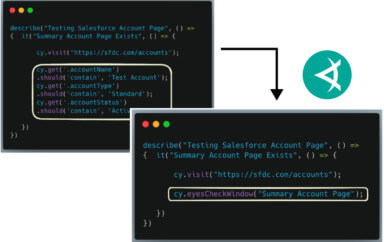
Let’s compare the code required, for a check where we are trying to achieve the same thing:
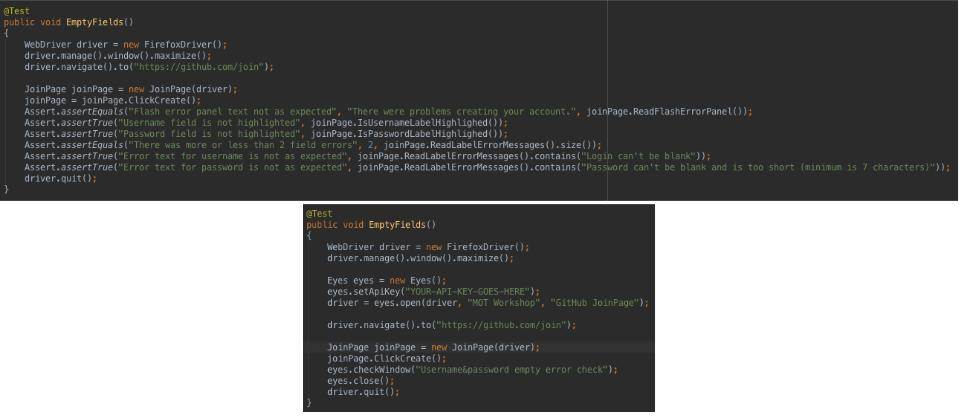
As you can see all the asserts are replaced with a single call to Eyes. They’re a few additional lines of code for setting up Eyes, but those could be abstracted out. You can also see that in the non visual tool check, I also have to store all the required text for the labels, error panel and context panels, something I can avoid in the visual tool approach.
Another advantage is that Eyes takes full window screenshots, so the in the Eyes example above, we would also be visual checking the rest of the page, increasing the coverage of the check. Now, granted, this could be a good thing or a bad thing, so instead of digging into that now, we will explore this in Richard’s next post.
In Conclusion…
Now of course, there is no “best way” to do things; it all depends on the context. However, in exploring Eyes and other visual checking tools, I am starting to see their advantage for specific checks, especially ones that play a big part in the user experience of the application, something hard to check just going of the DOM.
So I encourage you to explore your current approach to checking form validation, and ask yourself, is it good enough? Is it checking the right things? If the answer is no, then explore the links in this post, watch the video, and give visual checking tools a go, see if they could improve your approach.
To read more about Applitools’ visual UI testing and Application Visual Management (AVM) solutions, check out the resources section on the Applitools website. To get started with Applitools, request a demo or sign up for a free Applitools account.

Author: Richard Bradshaw. You can read more about Richard’s view on automation on his blog: http://thefriendlytester.co.uk. He is also an active tweeter, where you can find him as @FriendlyTester.