The QA team is the last frontier before your customers get their hands on your latest product version. Assuming your testing team has already completed smoke testing, integration tests, functional tests, end-to-end tests, acceptance tests and performance tests (not necessarily in that order) there’s still one piece of the puzzle: visual UI testing of your app front end.
The way many companies visually test their applications using image comparison tools. Some of these are free and some are paid. But in either case, these tools are not always reliable and often deliver false-positives (false alarms) that only frustrate both frontend developers and testers, and ultimately making you ship software late.
How Does Image Comparison Work?
Image comparison is simply pixel-by-pixel comparison, nothing more. Each and every pixel color in the base image is compared to the equivalent pixel in the checkpoint image. If all pixel colors match both images are identical. The chance of this technique working flawlessly is very slim. For this reason, image comparison tools give the user parameters to adjust such as pixel/color tolerance, which is the number of pixels that are allowed to differ between the two images.
But that’s not enough.
There are many ways in which images might seem to be identical but the pixels don’t match. Why does image comparison fail? There are many reasons:
Mouse Hovers
Even if the mouse points is not grabbed in a screenshot it may actually be hovering over an element that can be affected by it. Because changing the appearance of an element is trivial to do in CSS, JavaScript, JQuery, React, Angular, Vue, and other front-end developer technologies, this pattern is quite common in web apps.
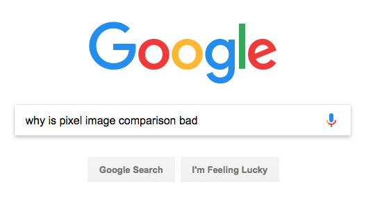
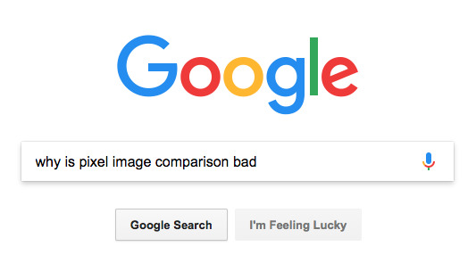
Here’s an example from a website you might be familiar with. In the top screenshot, the mouse isn’t hovering over the Google Search button; in the bottom screenshot, it is. See the difference?
Input Caret
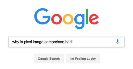
If you have a text element that is in focus it may have a blinking caret in it. Suppose when you did your baseline test, you captured a screenshot of the cursor. Then when you do your test, your screenshot captures the page at the instant when the cursor is invisible. A simplistic pixel comparison will fail, even though the UI doesn’t have a bug.
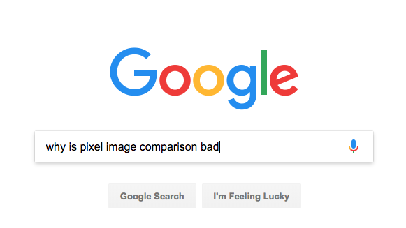
Here’s an example of this. In the top screenshot, the cursor is visible; in the bottom, it isn’t.
Font Anti-Aliasing
Each operating system renders fonts differently to make the font smoother and easier to read. It’s not just a Mac-versus-Windows thing; even an operating system upgrade can change font smoothing. Additionally, your testers might change a font smoothing setting without realizing how it will impact visual testing.
The point is, any of these can make simplistic pixel comparisons fail, even when there isn’t a visual UI bug.
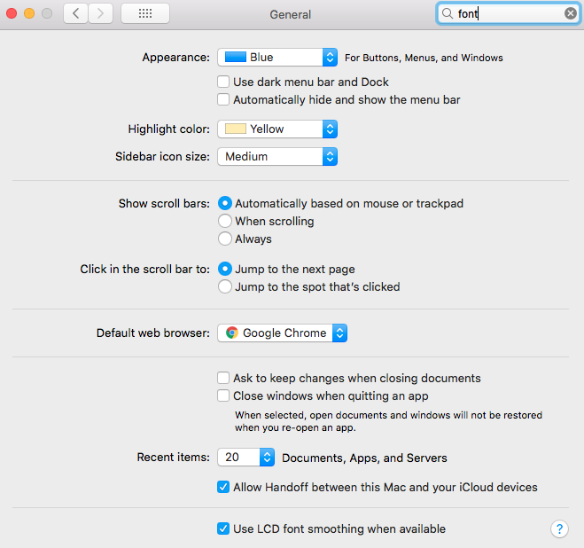
For this reason, it’s crucial for testers to understand how to control font smoothing on their test platforms. On macOS, the font smoothing setting is in System Preferences > General:
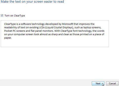
In Windows, ClearType is the technology used for font smoothing and can be turned on and off in the settings. The exact method varies by Windows version.
If pixel-based bitmap comparison is part of your test automation, you’ll want to ensure a consistent font smoothing setting programmatically. Here’s how to do that on macOS, and how to do it in Windows (if these techniques seem complicated — that’s one of many reasons customers use Applitools. More on that below).
User Interface Themes
If your testing team switches the user interface visual theme on a test computer, that will change image screenshots and cause simple pixel comparison tools to fail. These changes are very easy to make on both macOS and Windows, meaning it’s all too easy for testers to introduce changes that will visual UI tests.
Different Monitors
Higher resolution screens like the Apple Retina Display have more pixel density, so much so that pixels are not visible to the human eye. A screenshot taken on retina screen and a monitor with less pixel density will fail a simple pixel comparison, even if, to the human eye, there’s no apparent difference.
Here’s an example. The image on the top is a non-retina display on an iPhone 3GS. The image on the bottom is from an iPhone 4’s retina display.
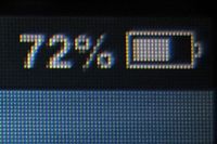
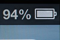
Neither one of these has a visual bug, but it’s obvious that they wouldn’t pass a simple pixel comparison, even if the battery levels were the same.
Graphics Cards
When different computers have different graphics cards, they can produce different screenshots. Or fuzzier screenshots. And even if you don’t change your graphics card, an older card that is about to fail can introduce screen glitches that lead to different screenshots over time.
Visually Testing Dynamic Content
In the real world your apps are not static and content changes constantly, using image comparison will not cut it to validate all pages in your app since you can’t automatically create a baseline for your tests. It takes more than pixel-by-pixel comparison to achieve that and manual testing is not a scalable solution either.
A good example of this is Gannett, the company behind USA Today and dozens of other news publications. They can’t use pixel comparison, because their screenshots constantly change as breaking news stories are added to their websites. For USA Today and other new sites, there is no constant but change itself.
AI To The Rescue
By emulating the human eye and brain, Applitools AI powered Visual UI Testing technology only reports differences that are perceptible to users and reliably ignore invisible rendering, size and position differences. The algorithms can instantly validate entire application pages, detect layout issues, and process the most complex and dynamic pages.
When writing an automated visual UI test, sometimes we will want to change the comparison method between our test and its baseline image, especially when dealing with applications that contain dynamic content.
Applitools Eyes can test the UI in four different comparison levels:
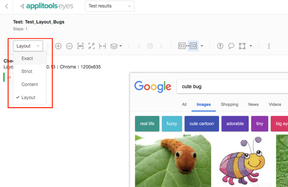
Here is how those comparison levels vary:
- Exact: pixel-to-pixel comparison. If you really want to do exact pixel comparisons, you can still use Applitools.
- Strict: compares everything including content (text), fonts, layout, colors and position of each of the elements. Strict knows to ignore rendering changes that are not visible to people. Strict is the recommended match level when running regression tests on the same browser/OS.
- Content: works in a similar way to Strict except for the fact that it ignores colors.
- Layout: compares the layouts (i.e. structure) of the baseline and actual images. It validates the alignment and relative position of all elements on the page, such as buttons, menus, text areas, paragraphs, images, and columns. It ignores the content, color and other style changes between the pages. Gannett uses layout mode extensively to test the layout of USA Today and other news sites.
Layout: Changing the Game
Applitools’ layout mode algorithm reverse-engineers the structure of the compared images by applying complex image processing algorithms resulting with the logical page structure of each image that includes all the components of the page. Then, it proceeds to map each component with its counterpart in the other image which allows detection of missing or new elements as well as misplaced ones. All such elements are considered different and are highlighted as such in the comparison result.
Layout mode will have greater benefits than other match levels in certain scenarios, which most notably include: dynamic content, language localization, responsive design, and cross-environment testing (including operating systems, browsers, devices, and form factors) since it is a more flexible approach of visual testing will have greater benefits.
But don’t take my word for it. In the following example (video below) I run a search in Google Images for two different keywords, grab screenshots of both results using Applitools Eyes, and show how Exact match level (which is doing pixel-by-pixel comparison) fails and Layout match level pass. Applitools Eyes is able to reverse engineer the image layout and the relation between all the UI elements on the page while ignoring the actual content of those images and text.
Pretty cool, right?
To learn more about Applitools’ visual UI testing and application visual management (AVM) solutions, check out the tutorials on the Applitools website. To get started with Applitools, request a demo, or sign up for a free Applitools account.


