Take a guess: how long have we been dealing with software bugs?
It’s not 30 years, around the time Windows was first released.
It’s not 48 years, the start of the Unix epoch.
It’s actually much longer. 71 years and 2 days, to be exact. Here’s why.
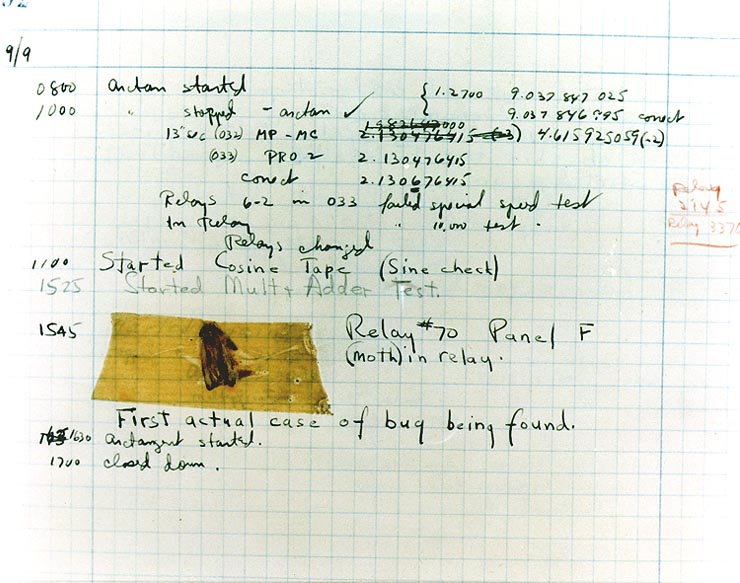
Back on September 9, 1947, Grace Hopper, a Harvard computer scientist, was running tests on a calculator and found calculation errors. She did some investigation and found a moth that had landed between two solenoid contacts, shorting out an electromechanical relay. Apparently, the bug had been attracted by the warmth of the machine.
We now commemorate this occasion every September 9, Tester’s Day.
As you can see in her logbook entry below, dated September 9, the actual offending moth was taped to the page. So not only is the first known example of a software bug, it’s probably the most tangible example of one as well.
71 years after Grace Hopper’s discovery, software continues to be infested with bugs of a more modern variety. Some of these have been pretty spectacular.
Like that time in the 80s when the entire world could have been destroyed due to a software bug.
Really.
The Bug to end all Bugs
Here’s what happened: a Soviet early warning system showed that five American nuclear missiles were flying to Russia.
You have to understand that this was during a particularly tense time during the Cold War, since the Soviets had shot down a Korean passenger jet three weeks earlier. And the United States and USSR both had over 50,000 nuclear weapons, each of which could destroy a city.
Thankfully, the Russian commander that saw this ignored the warnings, believing (correctly) that if the US were to attack the Soviet Union, it wouldn’t launch just five missiles. When the early warning system was later analyzed, it was later found to be riddled with bugs.
Thankfully, the bugs we’re seeing in 2018 are a bit less alarming.
But that said, they’re still pretty annoying in our day-to-day life, given how dependent we are these days on software. Let’s dive into some of them.
Trippy Text Layout

On the TripAdvisor mobile app, ratings are overlaid with the hotel name, making it so that, in some cases, you can’t read either. This doesn’t exactly encourage potential guests to make a booking on their app. And that’s a problem given how many travel booking apps there are out there.
Wanna Get A Way (to Book)

On the Southwest Airlines website, a visual bug prevented customers from clicking the Continue button and actually buying a ticket. The visual bug was that their Terms and Conditions text was overlaid on top of the Continue button. Southwest drives about $2.5M through their website every hour. So even if this bug was up for a short time, it would have cost them a lot.
The airline industry is very competitive. Not wanting to be left behind, United Airlines has done their part to cut off their revenue by hiding their purchase button behind text.

SerchDown

The ThredUp website prominently provides a convenient search field on its homepage. But it’s not so convenient to block access to buttons to view your shopping cart, or sign in to view your account.
No Order for You

On Amazon’s mobile app, there was a visual bug that prevented users from continuing the purchase process if they tried to switch their order quantity to something other than one. It’s like the software version of everyone’s favorite restaurant worker.
I’m Feeling Unlucky

For years, Google’s homepage has been minimalist in design so it loads quickly and they can help users find what they need and get on their way. However, this rendering of their website, using Chrome on macOS, seems to be taking minimalism a bit far.
Maybe privacy really is dead

Privacy permissions on social are a big deal. Some things you might okay with sharing publicly, and others you’ll want to share with just your network. With LinkedIn‘s overlapping privacy choices, whether a post is public or private can be a roll of the dice.
Repetitive Redundancy
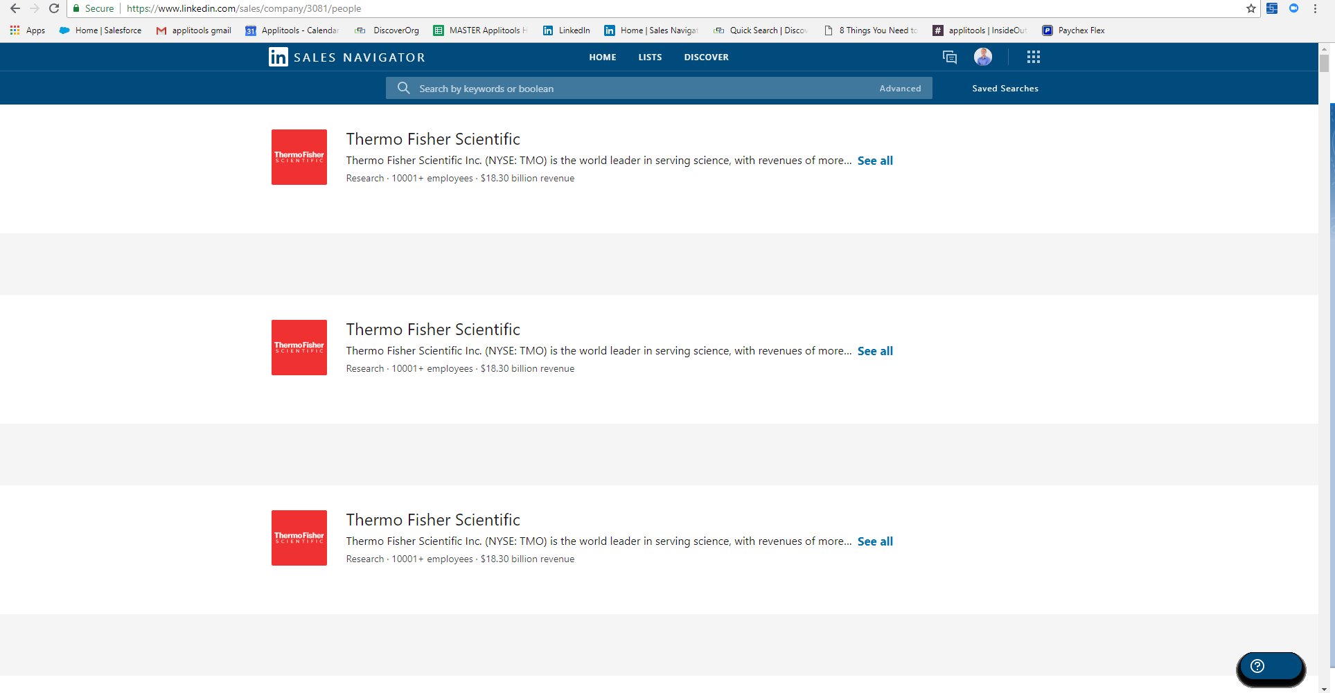
Speaking of LinkedIn, they’re a bit repetitive here…
Repetitively Repetitive Redundancy

With another repetition-based visual bug, we’re treading into dead-horse-beating territory here, but Banana Republic really, really wants to let you know that all denim and pants are 40% off.
Alexa, are you done yet?

On the Amazon Alexa mobile app, if you rearrange the order of the podcasts in your flash briefing, the app will still appear as if a podcast is still “settling in” to its new location, and the app will appear to be hung.
Home Screen Blues
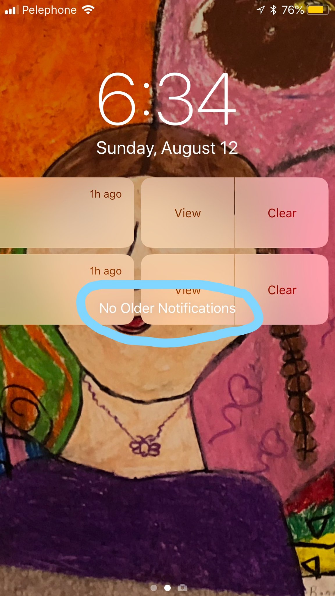
Apple’s iPhone home screen can sometimes improperly position the message that no older notifications exist.
Craigslist not looking so bad
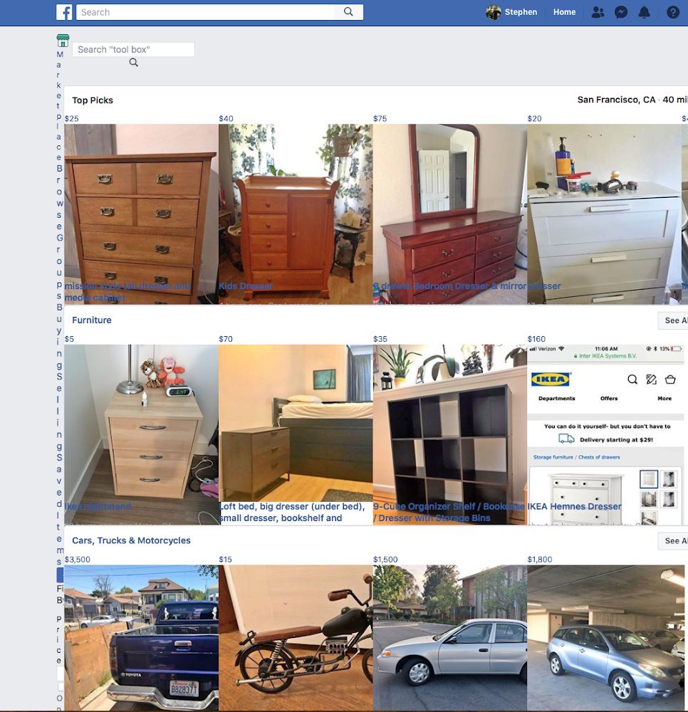
There’s probably some really useful text in that leftmost column of the Facebook Marketplace. We’re just not sure what it is.
What language is that?

You never know what languages you’ll encounter on an airplane. This is why, on the Air Canada site, they explain their commitment to speaking to customers in their preferred official language, whether it be English, Chinese, or whatever that third choice is. (I’m surprised French isn’t listed.)
So why does software have visual bugs?
None of these examples are intended to throw developers under the bus. Writing code is hard.
Anticipating every possible scenario is near impossible. Your users continuously interact with all kinds of devices with a dizzying variety of operating system versions, browser versions, screen sizes, font sizes, and languages.
When you multiply all these together, the number of different combinations can easily be in the tens of thousands.
That’s a heck of a lot more than this pile of phones:

So yeah, life’s not easy for developers.
At the same time, your web or mobile app is the now the front door of your business for an increasing number of users. And you have to ensure that storefront doesn’t have any visual glitches.
Unlike these guys:

Conclusion
But back to the software world. There, visual perfection can mean the difference between one of your customers loving or hating your product. That why at Applitools, we want to help developers and testers come together to find one class of bugs — visual bugs — as quickly as possible through visual UI testing.
We might not save the world, but hopefully, we’ll save you a bit of time in getting a visually perfect app shipped into production.
To read more about Applitools’ visual UI testing and Application Visual Management (AVM) solutions, check out the resources section on the Applitools website. To get started with Applitools, request a demo or sign up for a free Applitools account.
What bugs have you seen in web or mobile apps? Tweet them out with hashtag #GUIGoneWrong. If we like your entry, we’ll ship you one of our “Visually Perfect” shirts.


