The Insights - Test analytics tab displays charts that provide an at-a-glance view of test execution data, test results, and test scenarios. The scope for viewing information is role-based, as described in The Insights page. You can view charts by Account or by Teams that you are a member of, and within a selected Date Range.
Test Analytics reports
The Test Analytics tab displays the following charts:
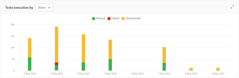
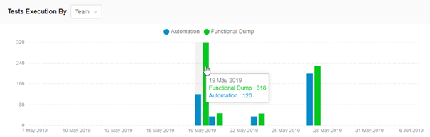
Tests execution by
This chart shows the number of tests executed within the scope and date range. It provides details of tests by status or by team.
-
The total number of test scenarios executed and broken down by test result status (Passed, Failed, or Unresolved).
-
The total number of test scenarios executed and broken down by team. This option is not available if the scope is Account.
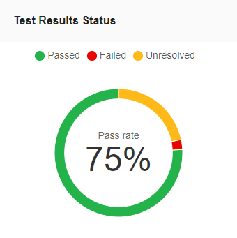
Test results status
This pie chart displays the pass rate for all tests executed over a set period. The pass rate is the ratio of passed tests compared to those that did not pass, expressed as a percentage.
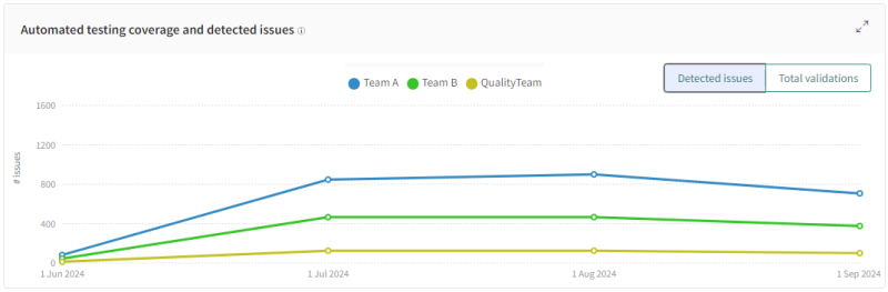
Automated testing coverage and detected issues
This chart has the following views:
-
Detected Issues – Number of steps manually rejected and bug regions added to accepted checkpoints during the selected period.
-
Total validations – Number of tested pages and components during the selected period.
If multiple teams are displayed, each team is represented separately on the chart.
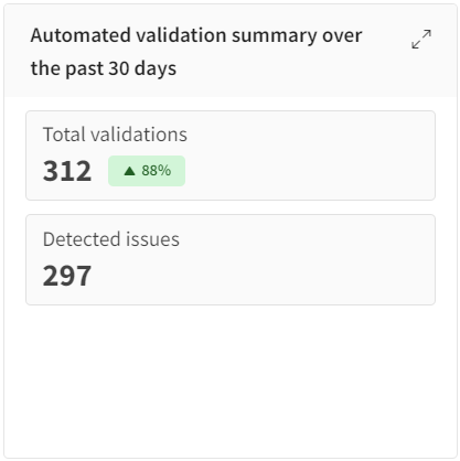
Automated validation summary
This chart shows the number of automated actions over the past 30 days. You cannot modify the time frame in this chart. Automation actions are accept or reject commands or regions that were automatically applied to other screens
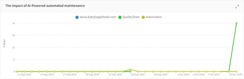
The impact of AI-Powered automated maintenance
This chart shows how many steps were resolved automatically over the selected period.
Time saved with automated maintenance over the past 90 days
This chart calculates the amount of time saved by auto maintenance over the past 90 days and past 12 months. You cannot modify the time frame in this chart.
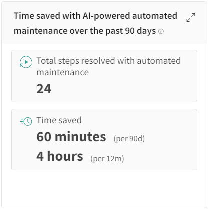
Time saved calculation is based on the assumption that the average time to manually review an app page is 2.5 minutes.
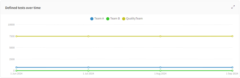
Defined tests over time
Shows the number of tests defined for each interval for the set period of time. If you have multiple teams displayed, each team is displayed separately on the chart.
Display Top....
The Top chart ranks Apps or Tests based on how fragile or stable they are and uses the percentage of executions that passed as the measure of Stability. The higher the percentage of Tests or Apps that pass, the higher the Stability. Conversely, the lower the percentage of Tests or Apps that pass, the more Fragile they are.
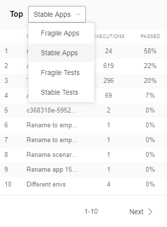
Use the drop-down menu to select one of the following options to display:
-
Top fragile apps
-
Top stable apps
-
Tests with low pass rate
-
Tests with high pass rate
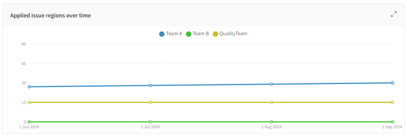
Applied issue regions over time
Shows the cumulative number of bug or comment regions that were added over time. If you have multiple teams displayed, each team is displayed separately on the chart.
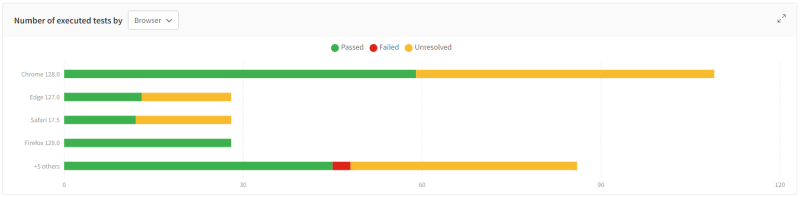
Number of executed tests by...
A bar chart that shows the total number of test scenarios executed with respect to one of the following parameters:
-
Assignee
-
Browser
-
Device
-
OS
-
Viewport