Before we start, we need to clear up some areas that tend to confuse people when it comes to mobile testing. If you’d like to test a mobile application built for iOS or Android, Cypress will not be efficient and you should probably reach for a tool like Appium (although there are some interesting examples by Gleb Bahmutov for React Native). Cypress is best known as a tool for testing anything that runs in a browser. So in order to use Cypress for your mobile testing, your app needs to be able to run in a browser. That brings forward a question: “What’s the difference between desktop and mobile web app?”
To answer this question, it’s best to look at the application in test from a perspective of a developer. As someone who creates a web application, you might want to consider a couple of traits that make the mobile app different from a desktop one:
- screen size
- touch interface
- any other information about the device
Let’s go through them one by one and see how we can write a Cypress test that would ensure our application works as expected. If you want to follow along, you can clone my repository with the application and attached Cypress tests. The simple example application shows different messages based on viewport width, presence of touch interface or user agent.
Testing the Viewport Size
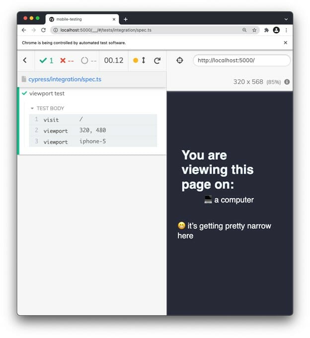
We might want to test a responsive CSS on different screen widths to see if the application renders correctly. This can be easily done by using the cy.viewport() command. You can specify width and height of the viewport, or choose from one of the predefined devices:
Using these commands will trigger visibility of a “it’s getting pretty narrow here” message:
<
CSS responsiveness can hide or show different content, like buttons or modals. A nice trick to test this is to run your existing tests with different resolution. To do that, pass a --config flag to your CLI command:
npx cypress run --config viewportWidth=320 viewportHeight=480You can also set the viewport width and viewport height in cypress.json or programmatically via Cypress plugin API. I write about this on my personal blog in a slightly different context, but it still might be helpful in this case.
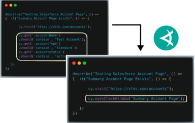
Depending on your application, you might want to consider testing responsiveness of your application by visual tests using a tool like Applitools. Functional tests might have a tendency to become too verbose if their sole purpose is to check for elements appearing/disappearing on different viewports.
Testing for Touch Devices
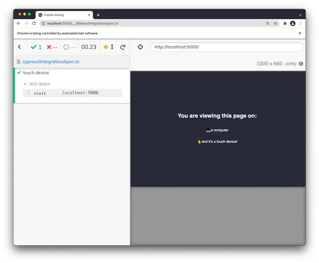
Your application might react differently or render slightly different content based on whether it is opened on a touch screen device or not. Manually you can test this with Chrome DevTools:
Notice how we can have a touch device, that is actually not a mobile. This is a nice case to consider when testing your app.
In Chrome DevTools, we are simply switching a mode of our browser. It’s like changing a setting to enable viewing our app as if it was opened on a touch device.
With Cypress we can do something very similar. There is an ontouchstart property which is present on a mobile browser. This is usually a very good clue for a web application to “know” that it is being opened on a touch device. In Cypress, we can add this property manually, and make our application “think” it is being opened on a touch device:
With the onBeforeLoad function, we tap into the window object and add the property manually, essentially creating a similar situation as we did in DevTools, when we toggled the “touch” option:
To go even further with testing a touch interface I recommend using Dmitryi Kovalenko’s cypress-real-events plugin that fires events using Chrome devtools protocol. Your Cypress API will now get augmented with cy.realTouch() and cy.realSwipe() commands, which will help you test touch events.
Testing with User Agent
Some applications use information from user agent to determine whether an app is being viewed on mobile device. There are some neat plugins out there that are commonly used in web applications to help with that.
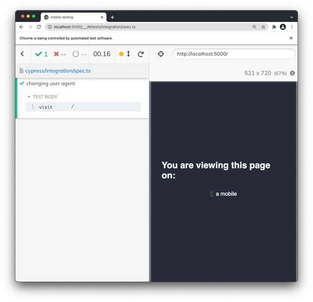
Although User Agent might sound like a super complicated thing, it is actually just a string that holds information about the device that is opening a web application. Cypress allows you to change this information directly in the cypress.json file. The following setup will set the user agent to the exact same value as on an iPhone:
However, you might not want to change the user agent for all of your tests. Instead of adding the user agent string to cypress.json you can again tap into the onBeforeLoad event and change the viewport on your browser window directly:
The reason why we are not changing win.navigator.userAgent directly via the assignment operator (=) is that this property is not directly configurable, so we need to use the defineProperty method. Opening our application in this way will, however, cause our application to render a message that it is being viewed on mobile device:
Conclusion
You cannot test native mobile apps with Cypress, but you can get pretty close with mobile web apps. Combining these three methods will help you narrowing the gap between desktop and mobile testing. To understand what makes an app behave differently, it is nice to look into your app as a developer at least for a little while.
If you enjoyed this blogpost, make sure to head over to my personal blog for some more Cypress tips.